A product design case study
Simplifying document verification for millions of William Hill customers
Services
Discovery, UX Strategy, Interaction Design, Usability Testing, UI Design
The brief
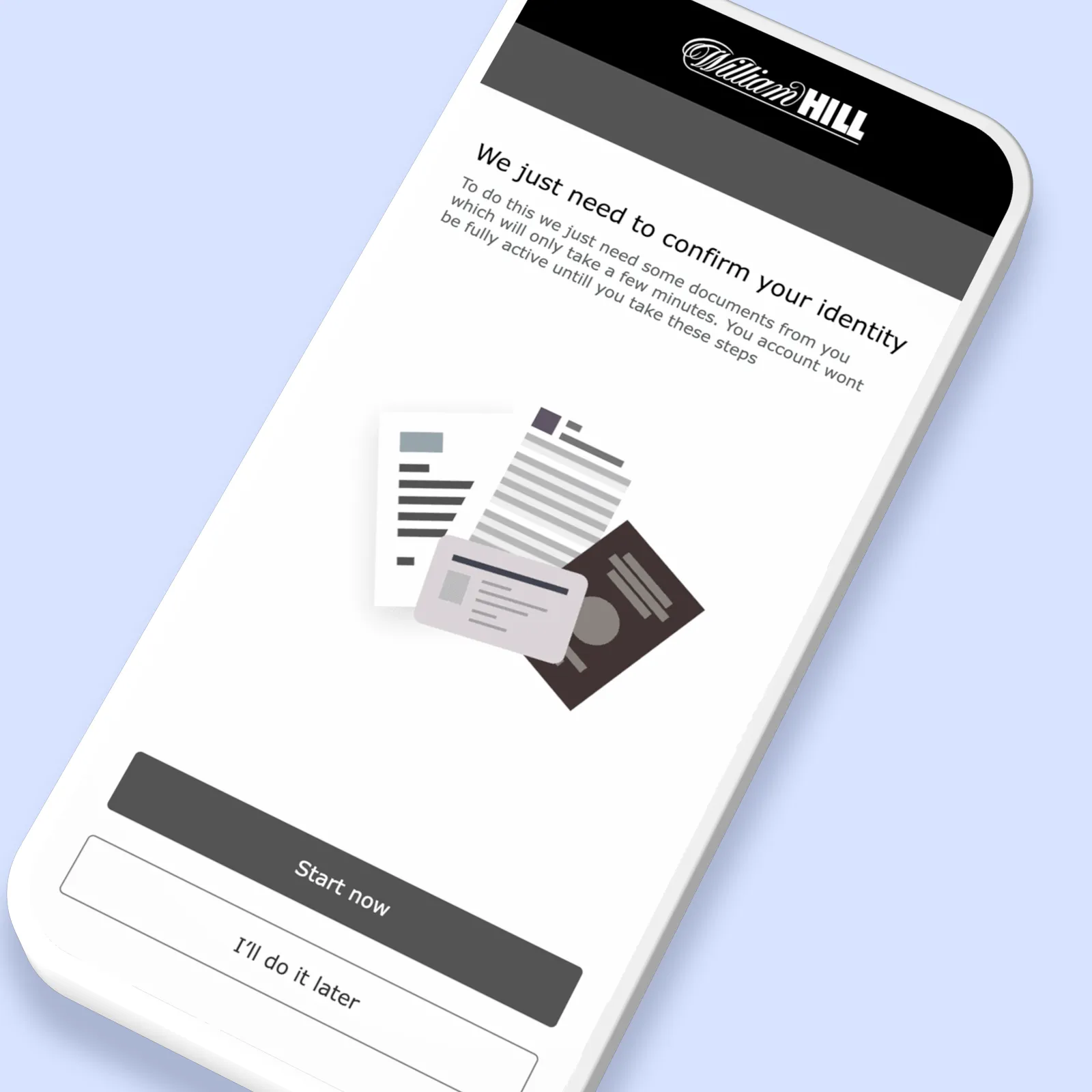
Document verification sat at the centre of some of William Hill's most important customer journeys. But the experience had evolved without a clear standard. Depending on the request, customers were asked to upload documents through email or a mix of disconnected tools, often with little guidance on what was needed or what happened next. With account restrictions in place until verification was complete, a straightforward task quickly became a source of frustration.
The result was predictable. Customers dropped out of the process, turned to Customer Service for help, and verification became the single biggest driver of support enquiries, generating around 200,000 requests every year.
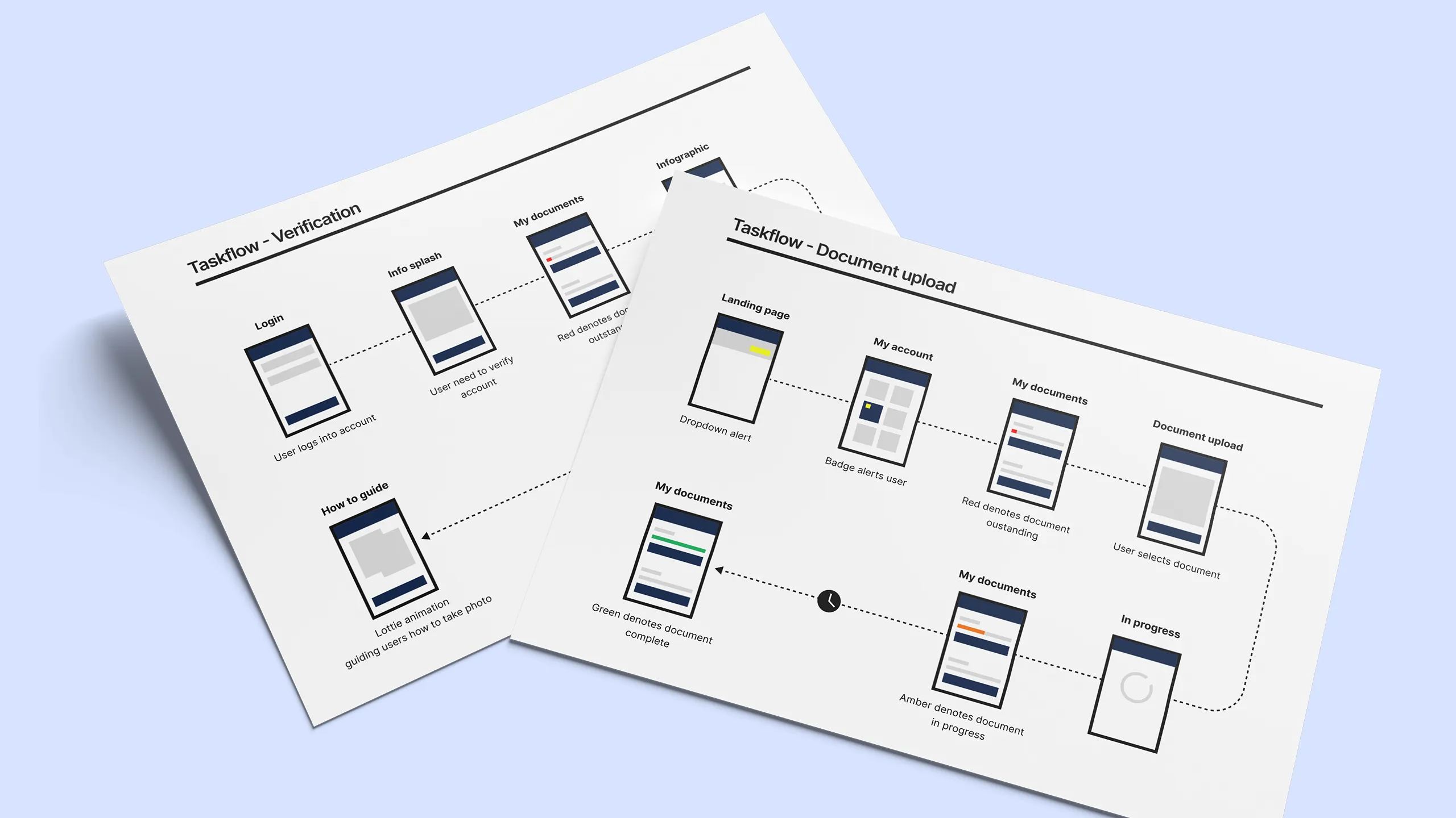
Using taskflows to build alignment
Taskflows became the foundation for every conversation. By mapping each customer journey end-to-end, we could identify pain points, technical debt and edge cases long before they reached development. They gave stakeholders confidence in the direction and gave engineers a clearer picture of what needed to change.
Bringing the whole team into the process
With the taskflows in place, we ran collaborative workshops with stakeholders, engineers and the Customer Service team. Using FigJam, we walked through each journey together, giving everyone the chance to question assumptions, flag technical constraints and add context from their own experience.
The workshops surfaced insights that would have been difficult to uncover in isolation. Engineers highlighted technical limitations, Customer Service shared the issues they saw every day, and stakeholders gained a clear understanding of where the experience was falling short. By the end, we had a shared view of the problem and a stronger foundation for the work that followed.
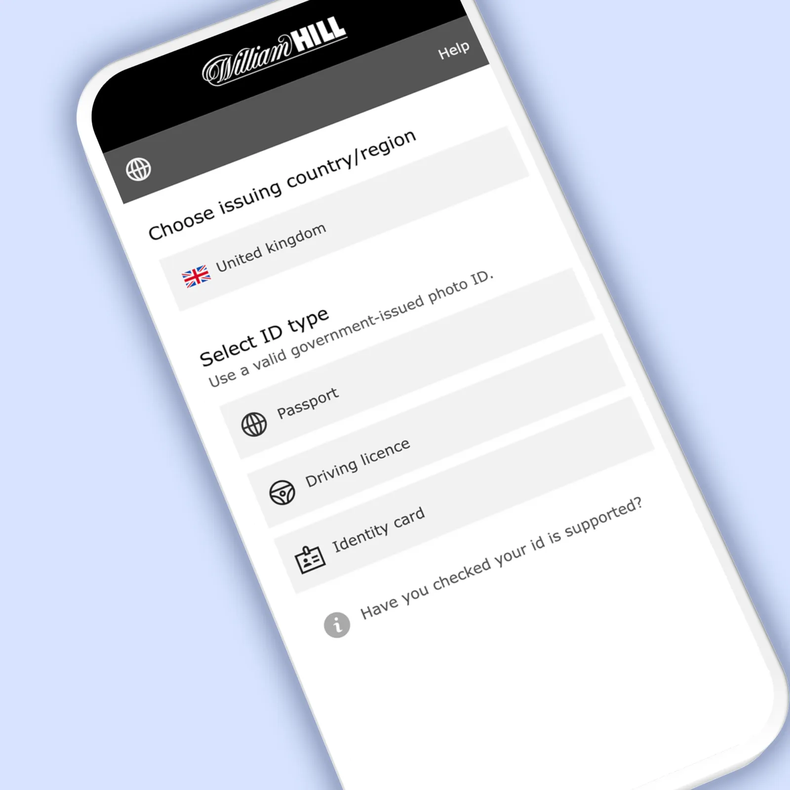
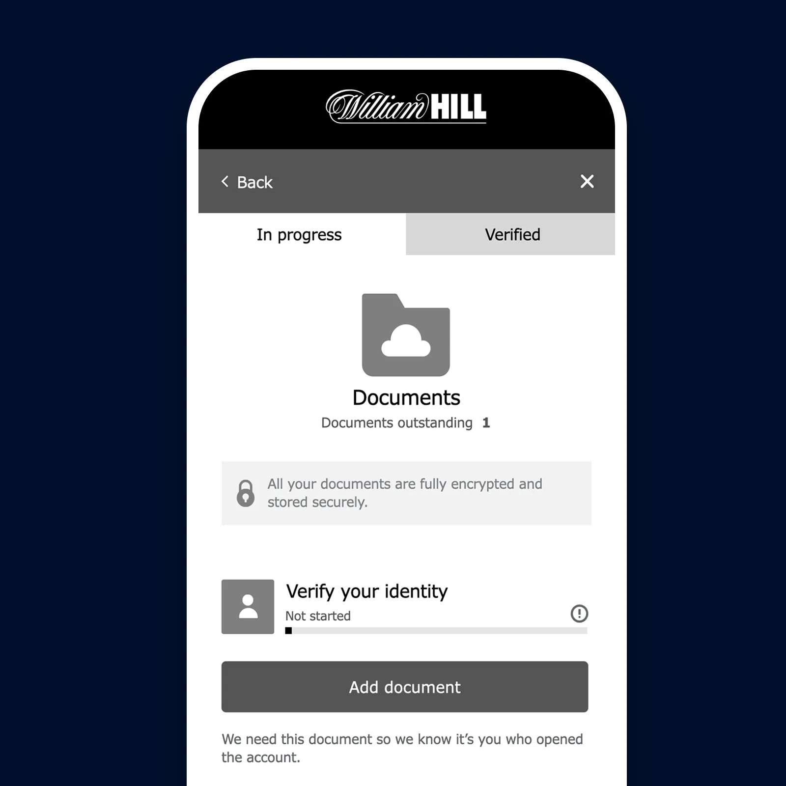
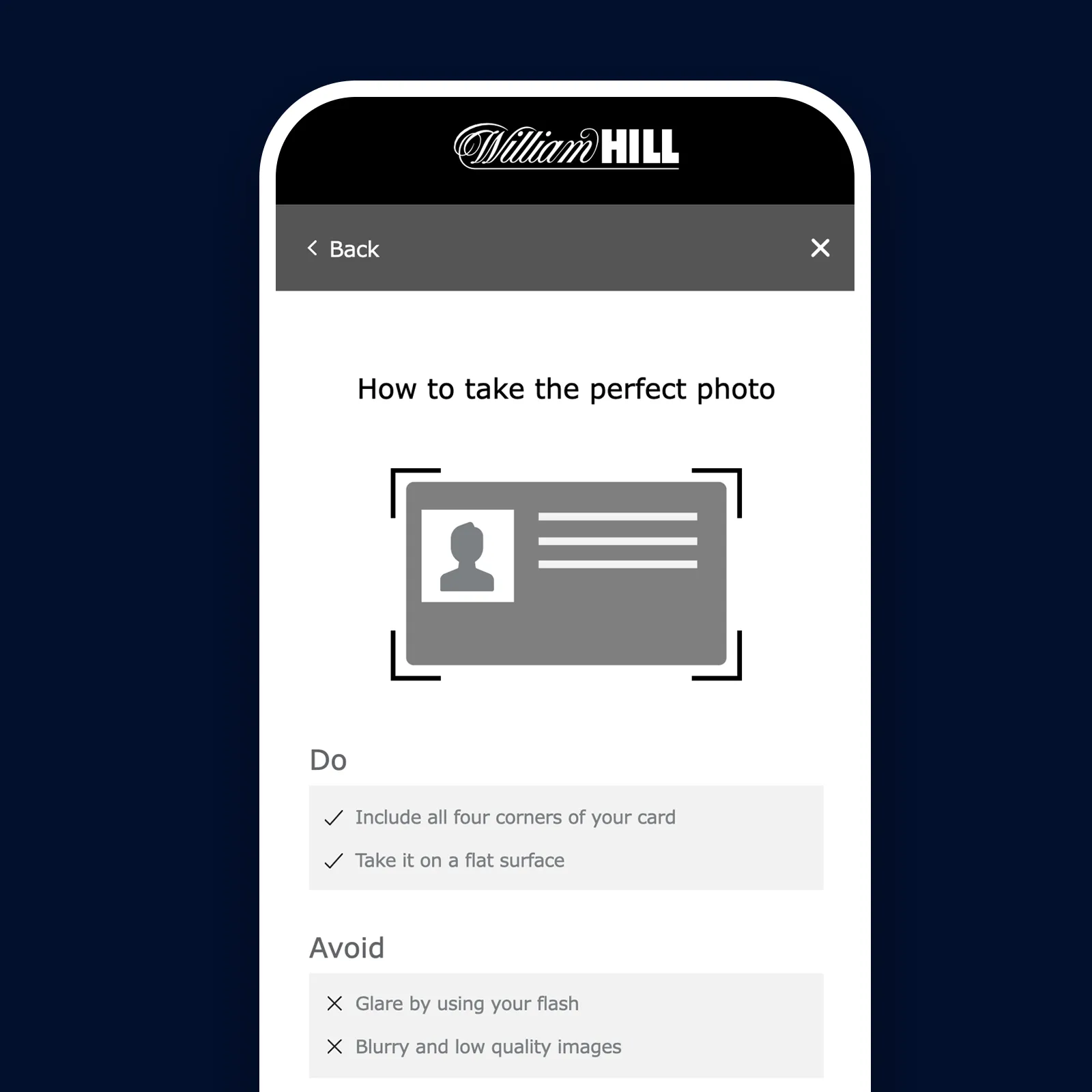
Focusing on the journey first
The next step was wireframing. William Hill had a habit of jumping straight into high-fidelity designs, where conversations quickly shifted towards colours, styling and visual preferences instead of the experience itself.
By keeping everything in low fidelity, we kept feedback focused on the journey. Stakeholders could review the flow, validate content and agree interactions without being distracted by the interface. Once every journey had been mapped, reviewed and signed off, we had a clear blueprint for prototyping and visual design.
Prototyping for real behaviour
Rather than testing individual screens, we built a prototype that behaved like a real product. Every entry point, exit point and decision along the journey was connected, allowing participants to move freely instead of following a scripted path.
This meant we could observe what happened when people made mistakes. Did they recover? Did they understand where to go next? Did they abandon the journey altogether? Those moments revealed far more than successful task completion. They exposed uncertainty, highlighted gaps in the experience and gave us the insight we needed to design a journey that worked, even when users took an unexpected path.
Unmoderated testing
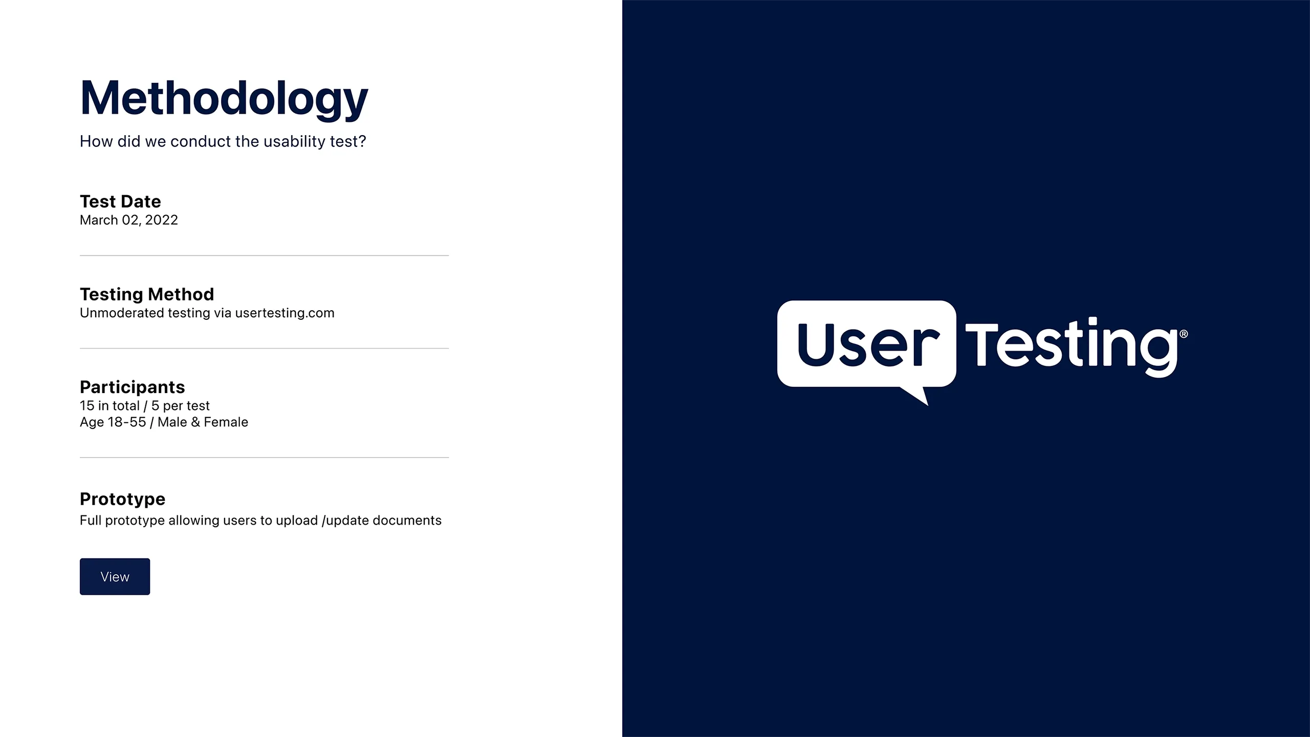
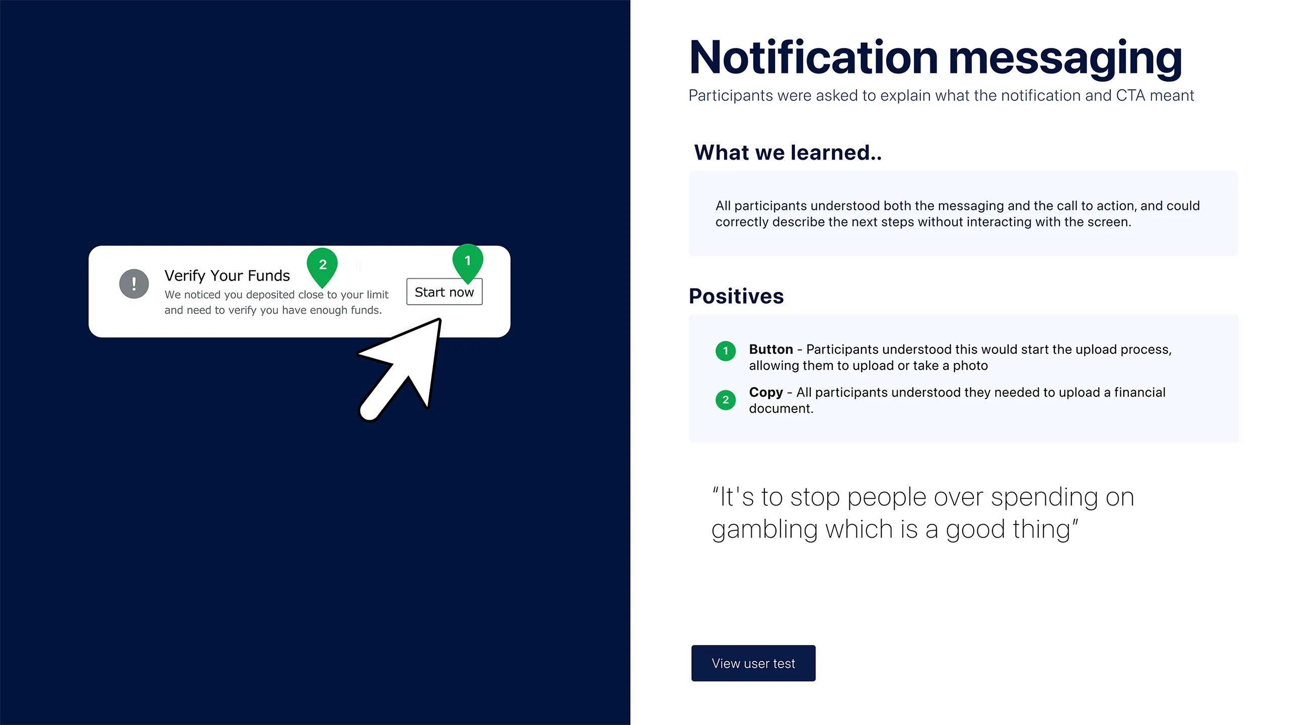
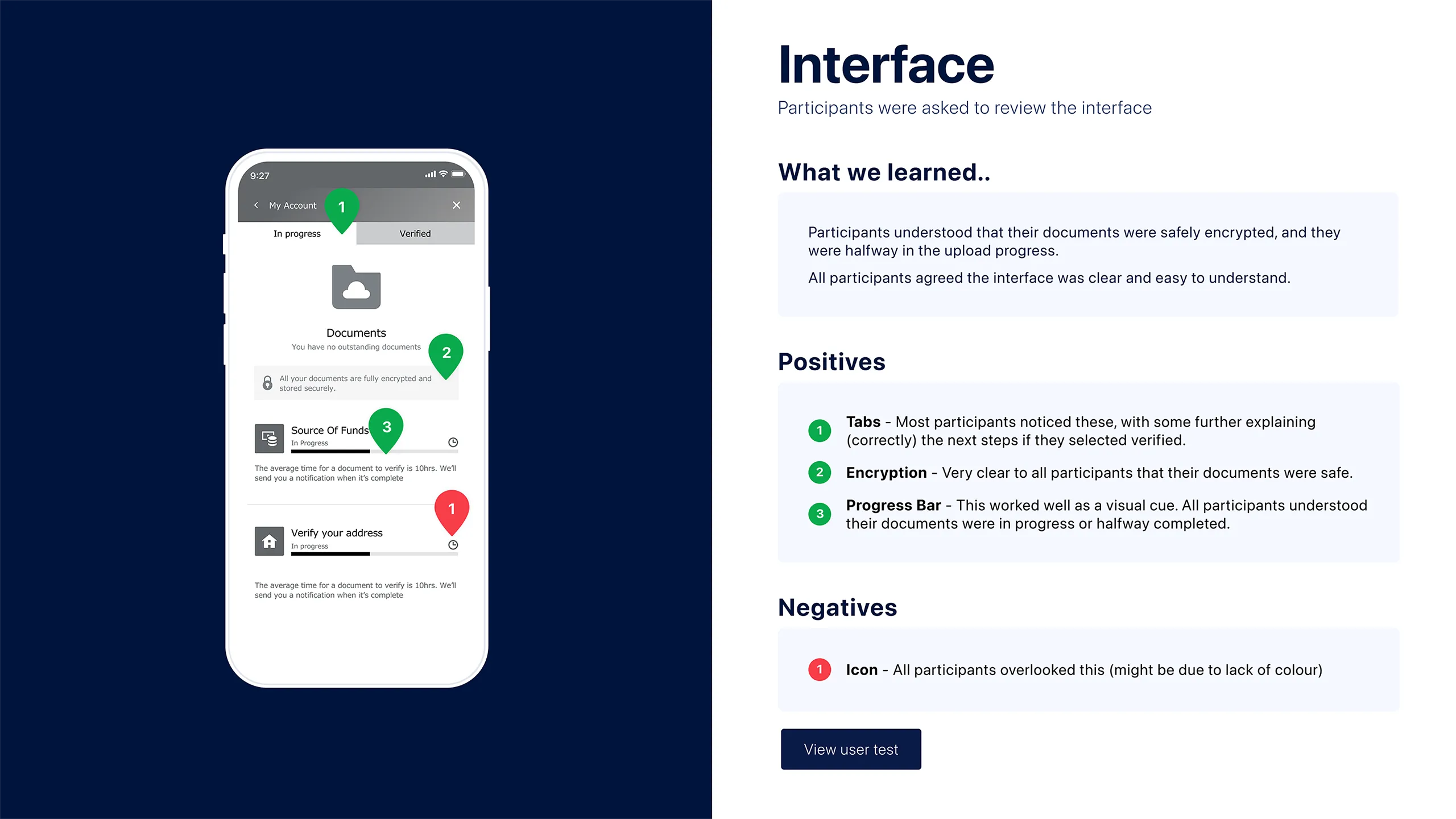
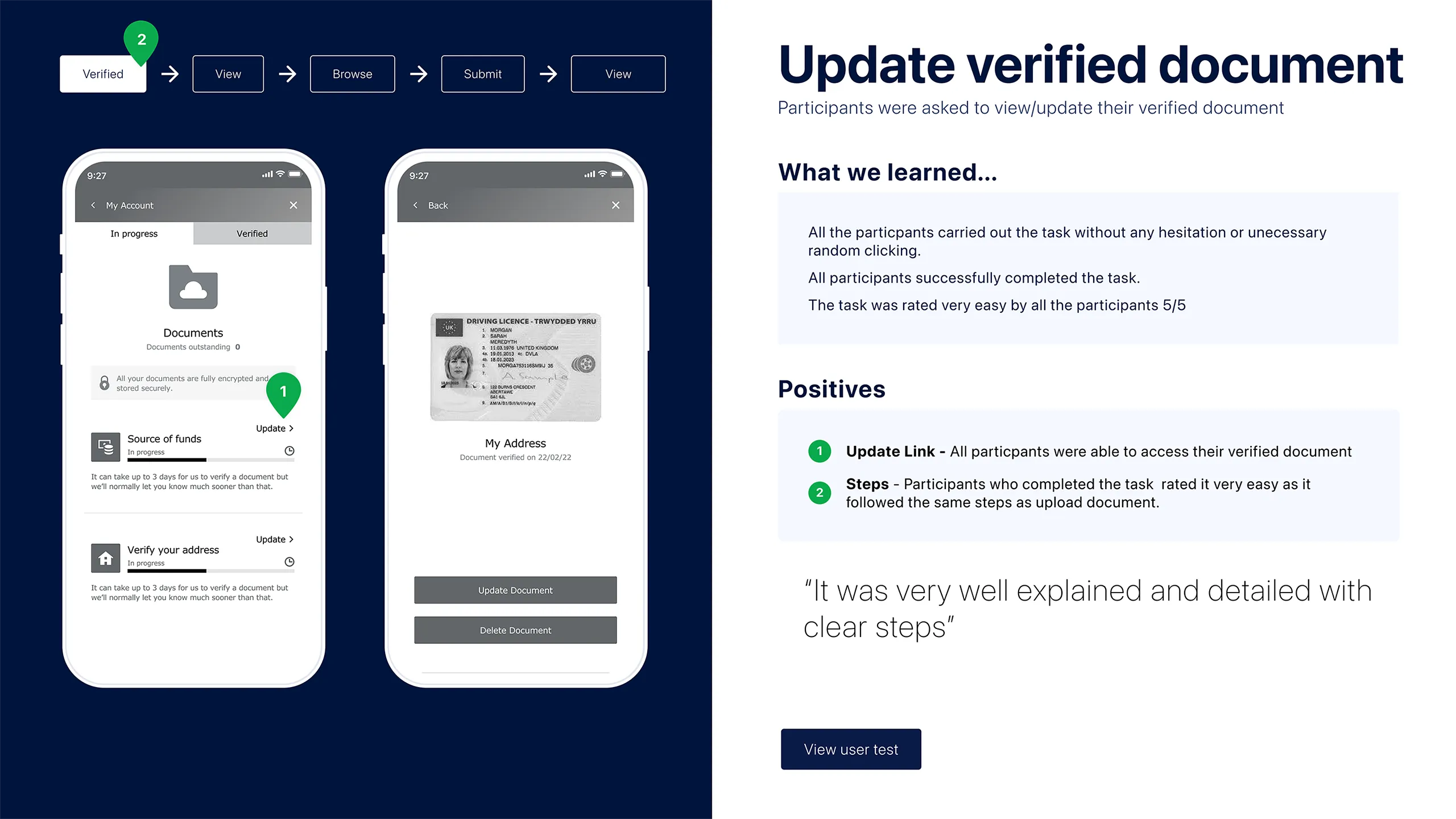
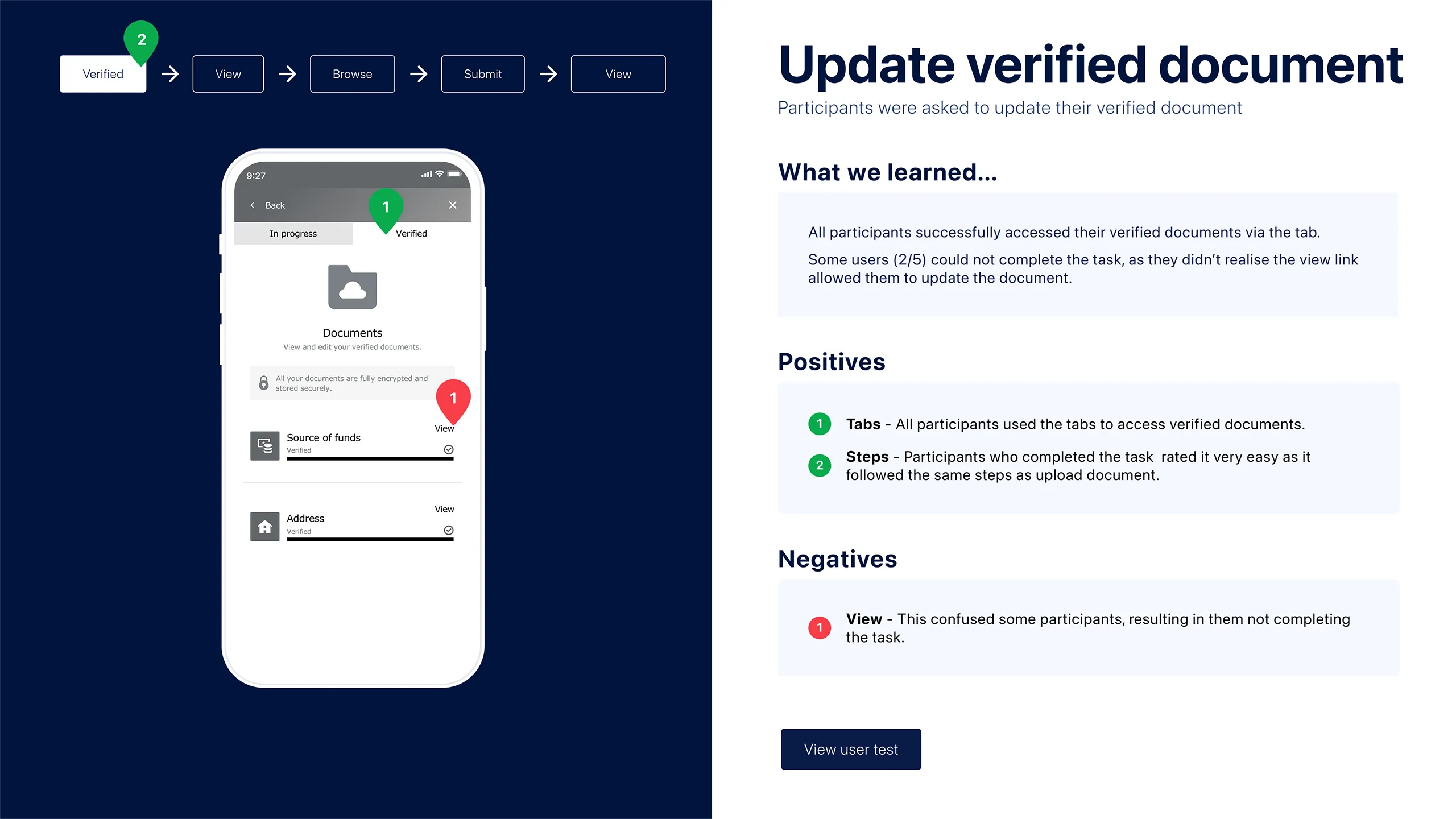
To validate the experience, we ran a series of unmoderated usability tests with screened participants. Using a fully interactive prototype, we observed how people completed tasks, recovered from mistakes and navigated the journey naturally. The insights directly informed the final design.
Replacing View with Update
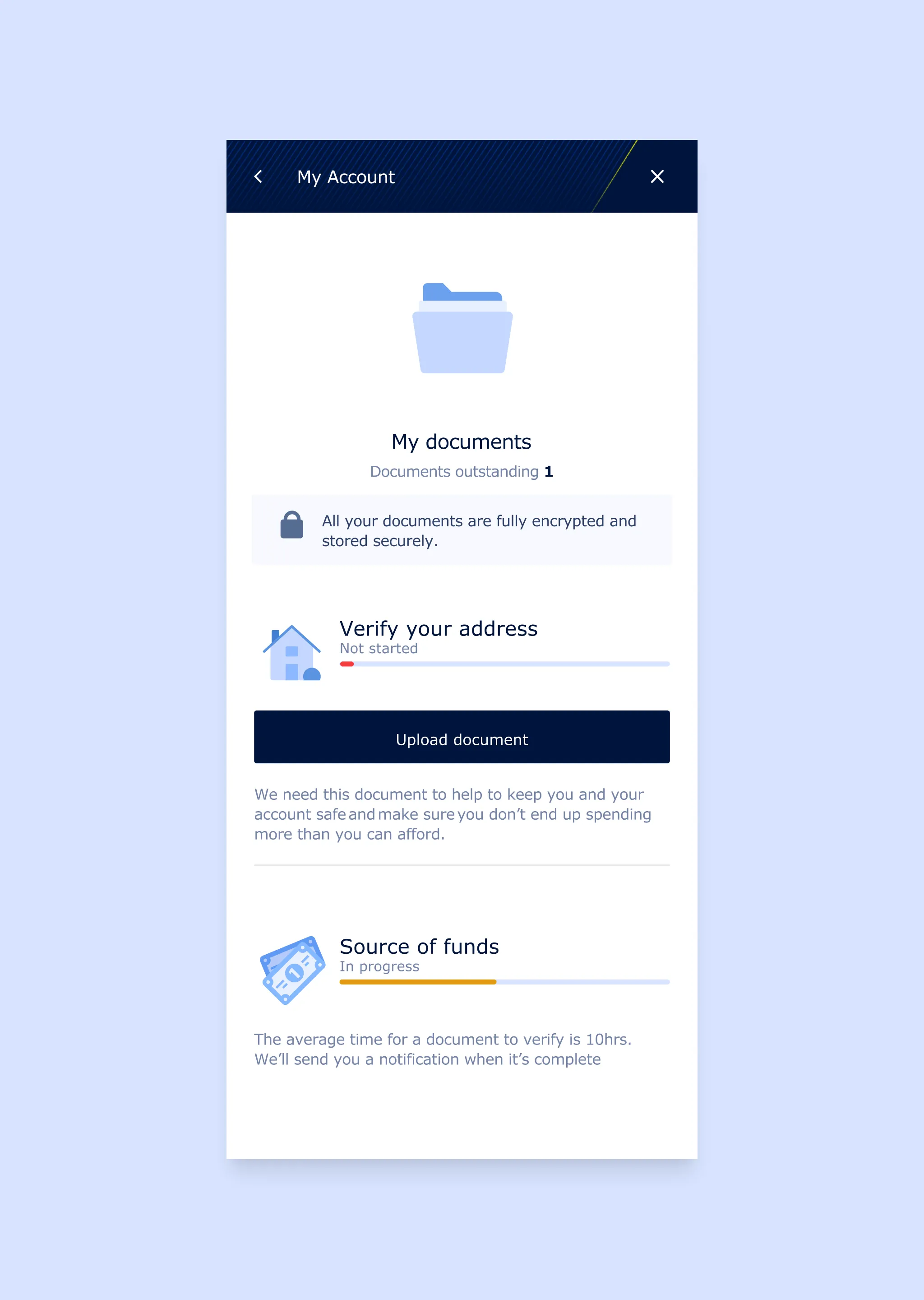
Two out of five participants didn't realise they could update a verified document because the action was labelled View. Renaming it to Update increased task completion to 100%.
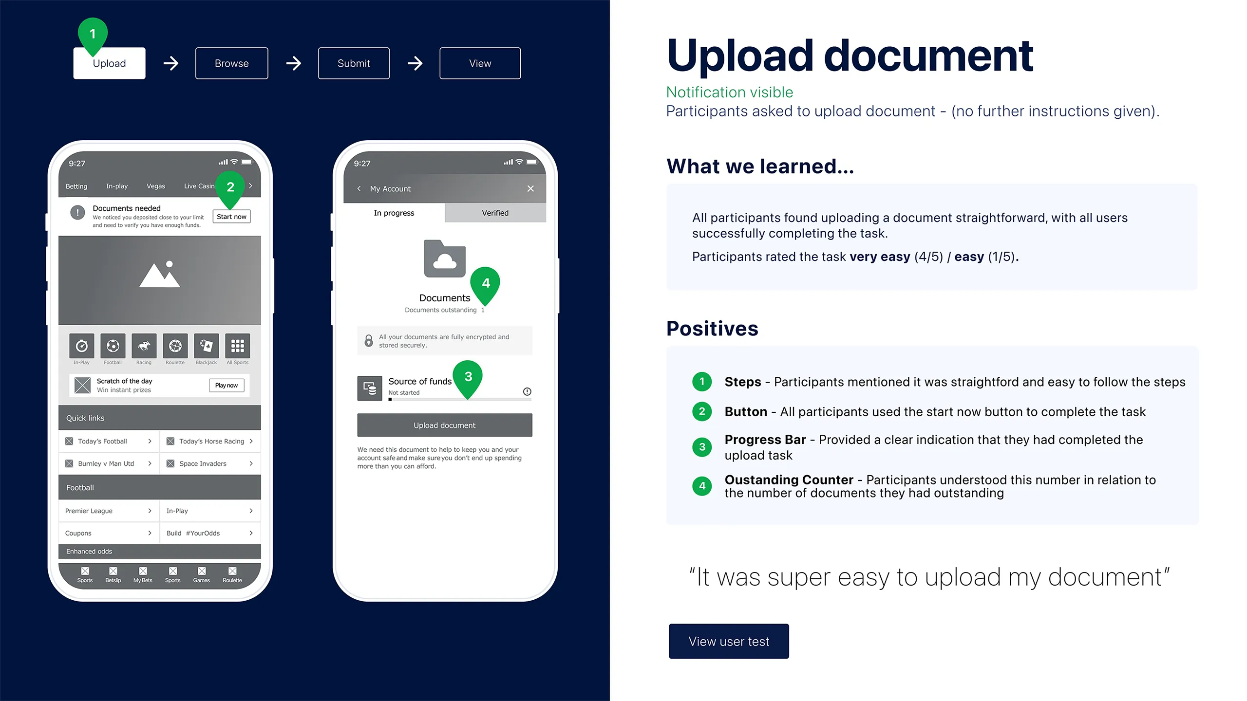
Testing notification visibility
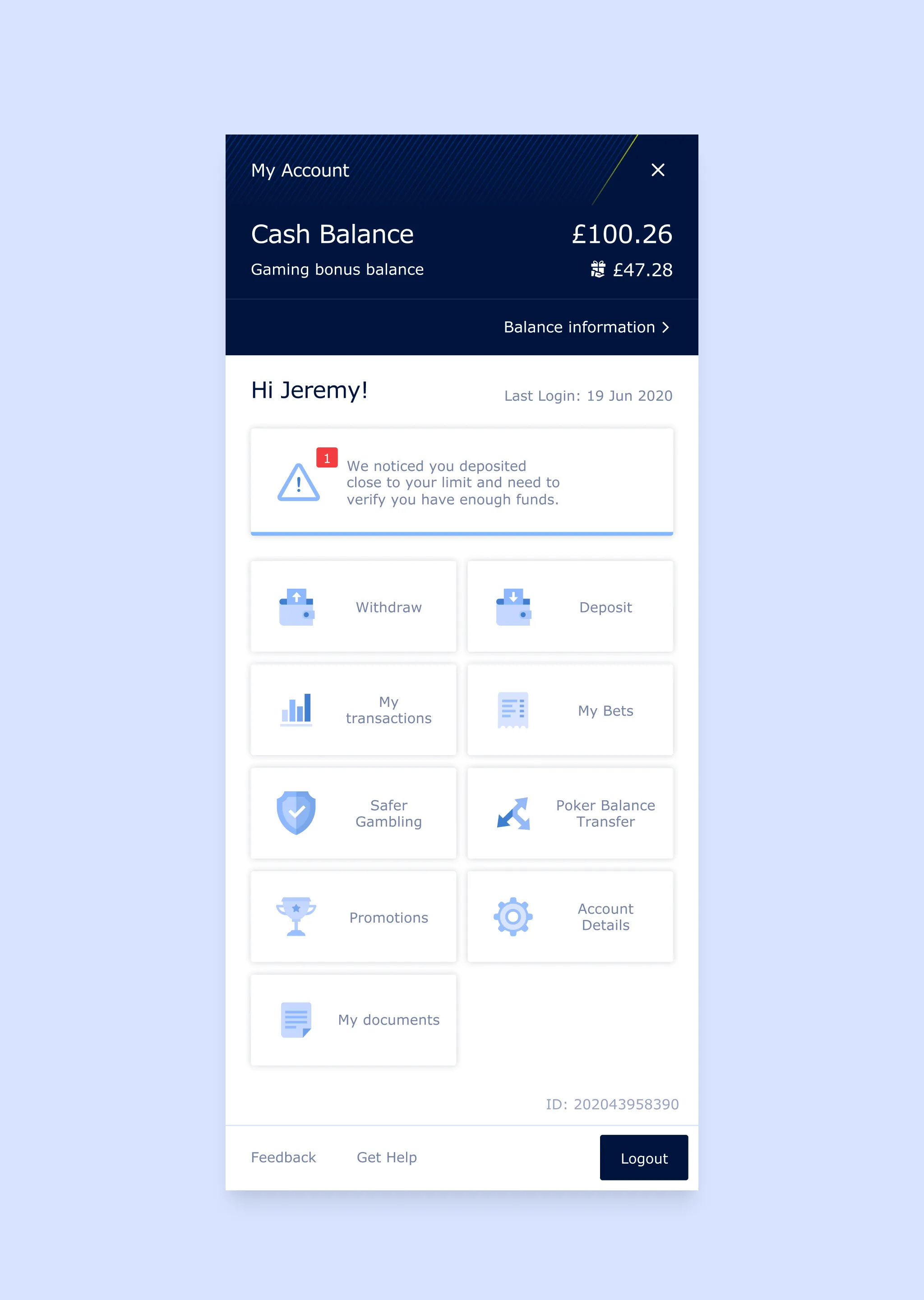
We tested whether the notification banner was necessary. Participants successfully found the upload journey without it, allowing us to simplify the interface.
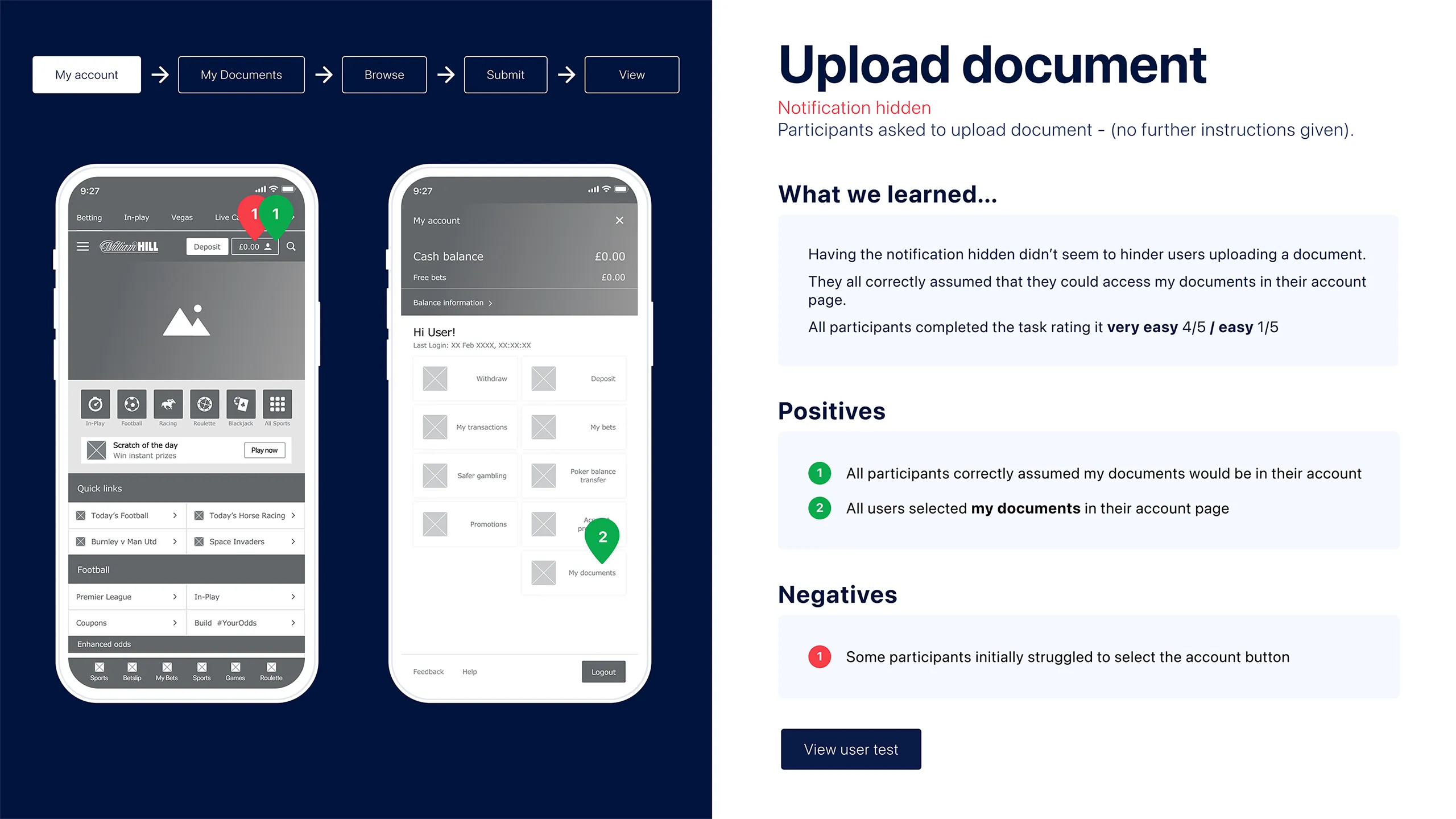
Validating navigation
Every participant instinctively looked for documents within their account, confirming the navigation matched users' mental model.
From validation to visual design
Regular reviews with the business kept stakeholders aligned throughout the process, ensuring the final interface reflected decisions that had already been validated with users.
The project established a single verification experience across multiple journeys, replacing fragmented processes with a consistent flow. By aligning stakeholders early, validating journeys through usability testing and iterating before development, the team reduced ambiguity and delivered a design that was grounded in user behaviour rather than assumption.